Controls
Auto-Layout, Snap to Grid, and Helper Lines.
The Controls panel provides graph editor interaction tools accessible via floating controls at the top-left of the canvas.
Available Controls
| Control | Icon | Description |
|---|---|---|
| Helper Lines | Show alignment guides and snap nodes to other nodes | |
| Snap to Grid | Snap nodes to the canvas grid while moving them | |
| Auto-Layout | Automatically arrange nodes into columns by dialogue flow |
Some controls expose additional settings through a dropdown next to the icon.
Snap to Grid
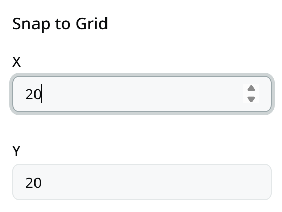
Snap to Grid is a toggle that snaps nodes to the background grid when you drag or move them.
When enabled, node positions align to the grid spacing shown on the canvas. This makes it easier to keep nodes evenly spaced and visually organised.
Open the options dropdown to configure:
- X — horizontal snap spacing
- Y — vertical snap spacing
Helper Lines
Helper Lines is a toggle that shows alignment guides while you drag a node.
When enabled, dashed lines appear when a node is close to aligning with another node.
Nodes snap to match:
- left, right, or center edges horizontally
- top, bottom, or center edges vertically
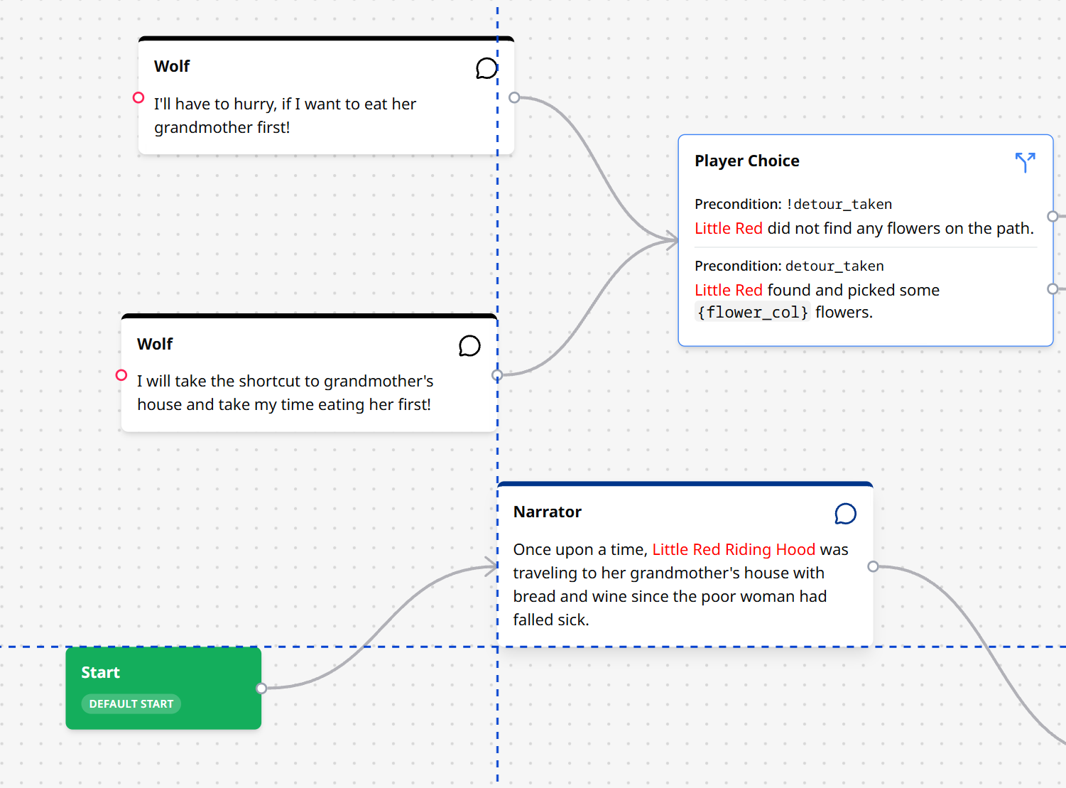
This is useful for lining up nodes without manually matching positions.
Auto-Layout
Auto-Layout rearranges every node in the conversation into a structured layout based on how they are connected.
Click the button to apply the layout. Nodes are placed in columns from left to right according to their distance from start nodes along the graph edges. End nodes are placed in the rightmost column. Nodes in the same column keep their relative top-to-bottom order.
Open the options dropdown to configure:
- Column Gap — horizontal distance between columns
- Row Gap — vertical distance between nodes in the same column
- Start X — horizontal offset of the first column
- Start Y — vertical offset of the top row
Unlike Snap-to-grid and helper lines, auto-layout runs once when you click the button rather than staying active while you edit.